Armchair BEA 2016: Aesthetic Concerns

This is my first year participating in Armchair BEA and I have no idea how many of these posts I will be doing or how I can participate because I do run on Australian time, but I am ready for some fun. You can check out my introduction post, but today we are talking about Aesthetic Concerns. It’s split into two parts; the first books and then it’s all about the blog. So let’s get into it.

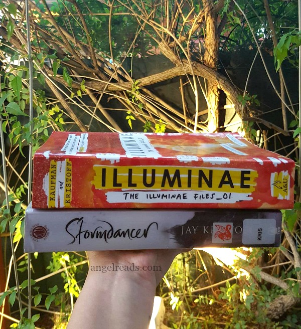
If you say that you don’t judge a book by its cover you are lying. Everyone one does it, even if they think they are not. Say you are at a book store and then something catches your eyes – that’s the cover. We should not do it, but we do, it’s the way our brain works – it just likes pretty things. I did do a full discussion of this a couple of months ago, that does go into more detail.
I also like – okay more like love that all my books match. I get quite angry when they are all mix matched ranging from the cover to the size of the book. So sometimes I wait to buy a series so I know I am getting them all the same or sometimes I go and buy a full new set, though this does not happen often.

In saying this, I do buy books with covers that are not my favourite mainly because, I do want to read what is inside. However, what I don’t like is when the cover doesn’t match what is on the inside of the book. The covers has to do with something, even if it is something little – it does have to match.

I have been book blogging for 5 years and I had never given much thought until this year about branding. It just never came to mind when I started, but now it’s coming quite common it the book blogging community.
I guess for me when people look at my blog – mu website – they think of the Angel and purple at first. It has always been my brand – pretty much from the get go. And that is most likely never going to change.

I also take pride in my book reviews, I love writing and sharing them with everyone and I do put quite a lot of work into them and have created a ‘me’ review in a sense that they sound like me. Well I think they do.
I also love creating features on my blog and I have done quite a few, like my most recent one of interviews with #LoveOZYA Authors.
I think that creating a book blog aesthetic is quite hard to do for yourself, so if anyone has ideas of what you would say mine is, do tell, I would love to know what you think.
How is your blog branded? What is its aesthetic? How do you judge books by their covers? Let’s Chat.
I love talking, so talk to me over on my twitter @angel_reads, Facebook, instagram, tumblr and Goodreads. You can also follow Angel Reads on Bloglovin and via email (in the side bar)

 What is the name you prefer to use?


